

Slowin
Designing a Wellness Retreat Booking Experience
For my second project at Ironhack, our team designed the online experience for a wellness retreat: a business helping people escape the daily grind and reconnect with themselves. What started as “redesign a website” quickly became a deep dive into something harder to design for: trust.
Project Duration:
2 week Sprint
Scope:
UX Research - UI design - UX design
Project members:
3
Tools:
Figma, Claude Ai, Gemini, Figjam AI


Getting to know the business
Our stakeholder interview was one of the most clarifying moments of the project. Hearing the founder describe her own vision gave us a real sense of the service and who it was for. Our competitor analysis, looking at three other wellness retreat websites, revealed a clear gap: booking was often missing entirely or pushed to a separate site. That disconnect became our opportunity.
Our user persona, built at this stage, lined up closely with the audience our stakeholder had described.


What our interviews told us
User interviews surfaced consistent themes: trust was everything. People wanted to know what was included, whether they’d enjoy it, and whether an unfamiliar place was legitimate. Work-related stress was the top reason people considered a retreat at all. Refining our persona was easy, it just confirmed what we suspected.
The harder part was the problem statement. Unlike our first project’s broader statement, this one needed to capture trust and unfamiliarity while staying groundable in something designable: a website’s navigation and booking system. Turning something emotional into a concrete design challenge took real back-and-forth. From there, we mapped the user journey to see where trust broke down and where we could rebuild it..
“If I’m really looking to disconnect, I prefer doing it alone, or possibly with my husband but not as a trip with friends”
“I need to know where it is, how to get there, the full program, how is the sleeping situation, how long it is etc.”
Ideation: Crazy 8s and sticky notes
Setting the tone with brand design
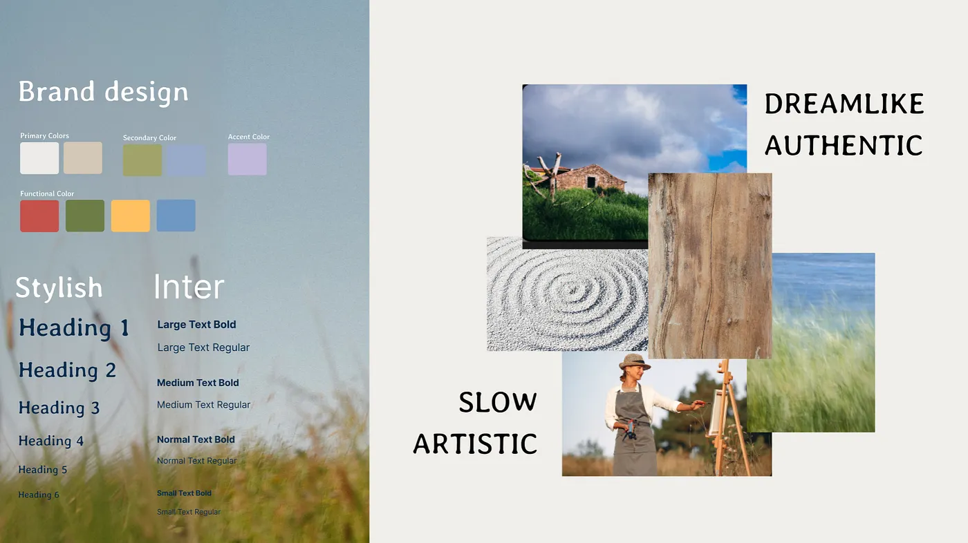
We put together a style tile to anchor the visual direction: dreamlike, authentic, slow, artistic. The moodboard leaned on natural textures paired with a soft, earthy color palette. It became a quick reference point whenever we debated a design choice: did it feel calm and authentic, or too polished and salesy?
Mapping the flow and hitting a wall on the sitemap
The booking flow was clearly the most critical piece of the site, carrying the weight of legitimacy and trust. The rest of the pages mainly showcased the retreat itself.
The sitemap was surprisingly difficult. Each of us had a different mental model of the structure, and the exercise left us more confused about the architecture than before a reminder that alignment needs to happen early, out loud.


Looking back
What struck me most wasn’t the visual design it was how much hinged on something intangible: trust. Every decision, answered the same question users kept asking: can I trust this enough to say yes?
Designing for that meant every feature had to answer a doubt, not just add functionality: a lesson I’ll carry into every project from here on.


